Overhauling EdTech's top web filter to protect over 23 million students
- Role
- Senior Product Designer
- Company
- Lightspeed
- Year
- Q2–Q4 2023
- Team
- Matthew Burg, Derek Laurie, Rob Chambers, Ryan Bond
The impact
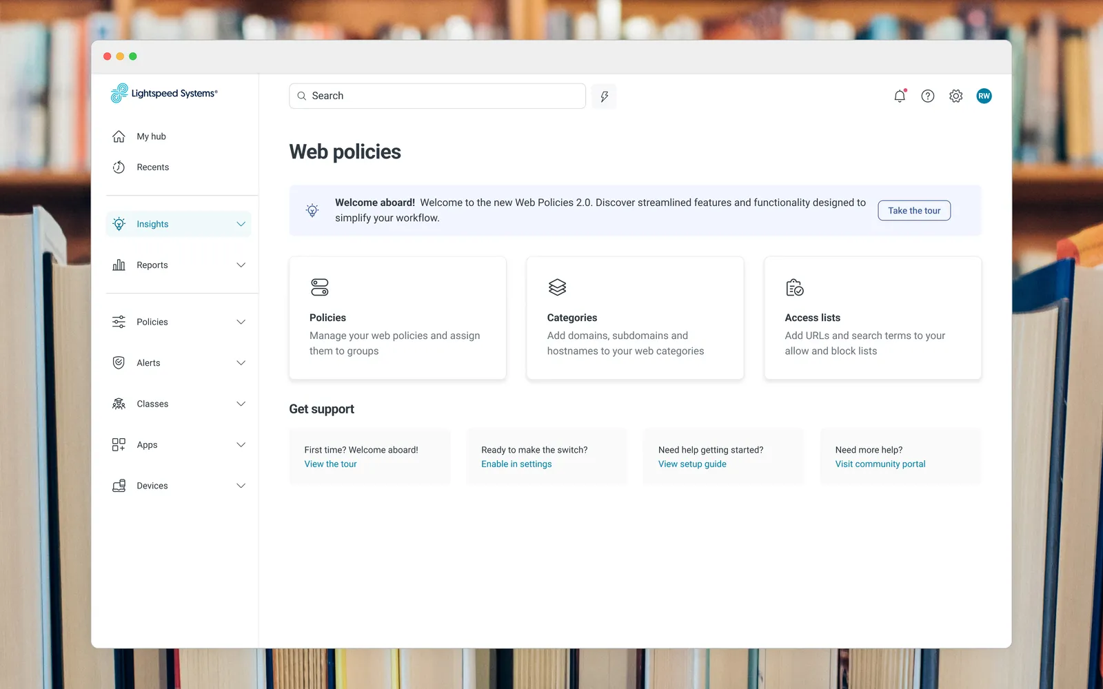
Lightspeed’s core web filter protects 23 million students internationally and drives $60M+ in annual revenue. I led the complete design overhaul that took it from a cluttered legacy tool IT admins dreaded into a system built around how they actually work.
Rethought web filtering from first principles
How might we rethink web filtering for IT admins to better protect kids online? The legacy product buried admins in excessive rules, toggles, and settings. Policy and group management meant constant navigation between interfaces, and troubleshooting meant untangling a maze of combined policies and inherited rules across school districts.
Business objectives
- Increase retention / decrease client churn
- Increase net new clients
- Achieve 80%+ client switch-rate to the new system (during summer months)
Bet on one system of record, not another patch
Rather than fix the legacy tool’s worst pain points one at a time, I proposed rebuilding around a single decision: policy and group management should live in one place, with one clear relationship between them, instead of two interfaces stitched together with inherited rules. Everything that followed was built on that bet.
Rebuilt it to save admins time and districts money
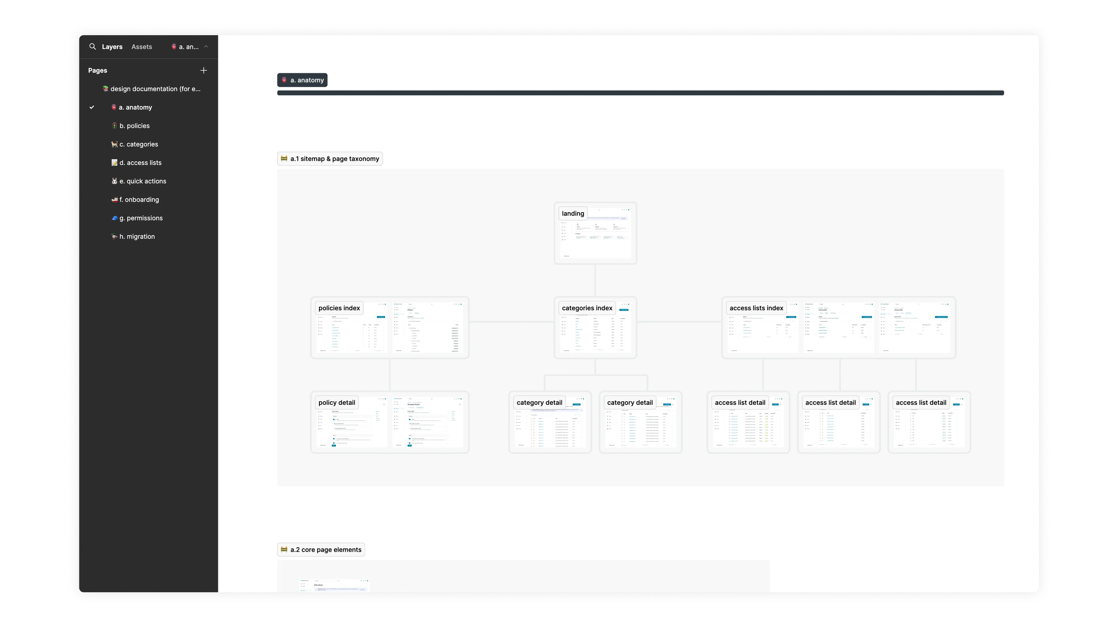
I led a comprehensive overhaul: new information architecture, reorganized page layouts, and streamlined settings. Policies and groups could now be managed from a single location, and troubleshooting was simplified by assigning discrete policies to users and groups instead of inherited rules.
I also designed a new client community portal and scheduled reporting feature that lets IT admins share insights directly impacting student safety and wellbeing. Alongside that, I worked with the design system team to help scale a custom design system in Figma across the product portfolio.
Cut the policy view down to what admins actually need
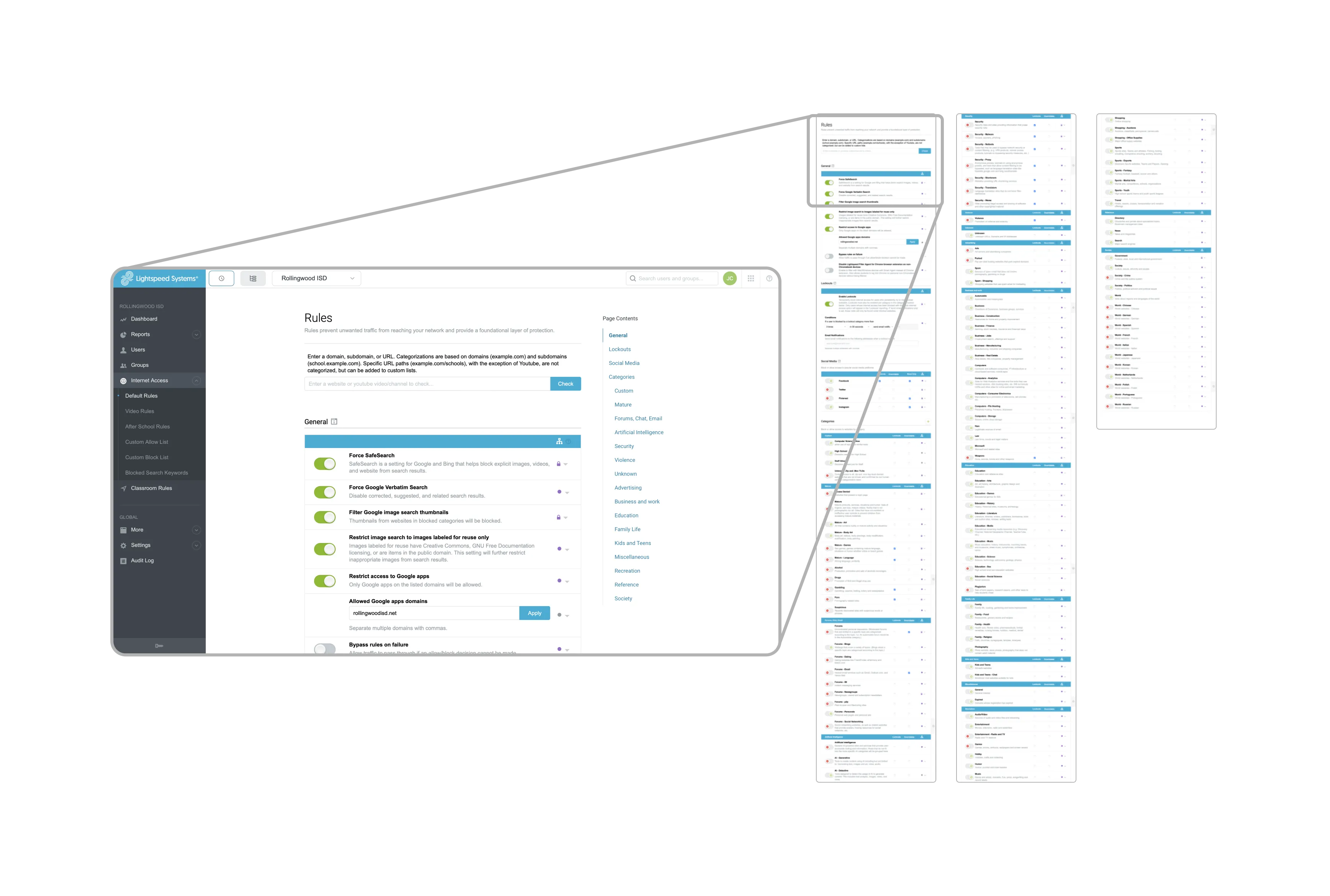
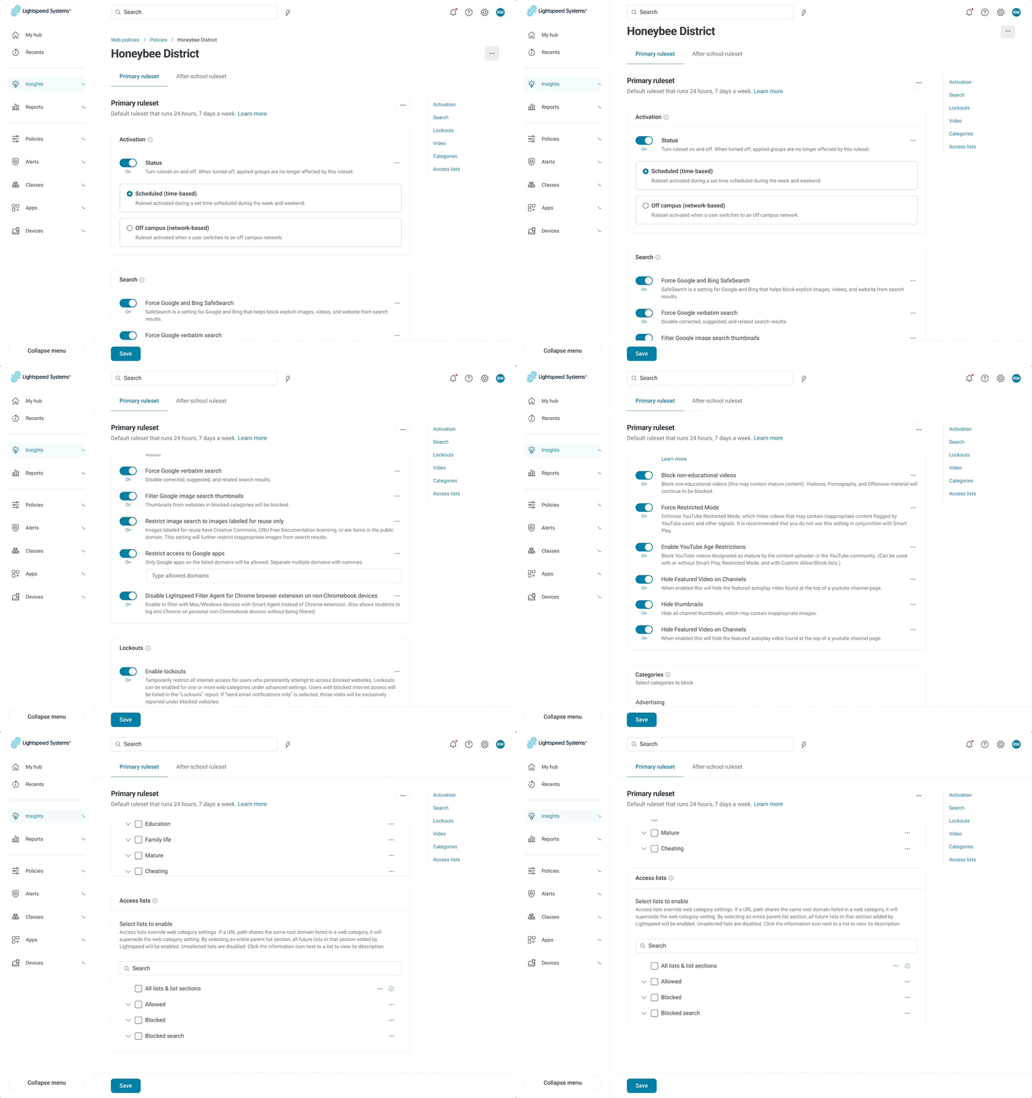
The legacy experience was cumbersome, with over 30 web categories, subcategories, and disorganized filtering features that were hard to find. I compressed key areas of the policy experience, improved the page hierarchy, and updated the toggles and controls to modern UI best practices, letting IT admins understand system settings at a glance.
Old way: A long, scroll-heavy list of 30+ categories.
New way: Compressed into a glanceable view.
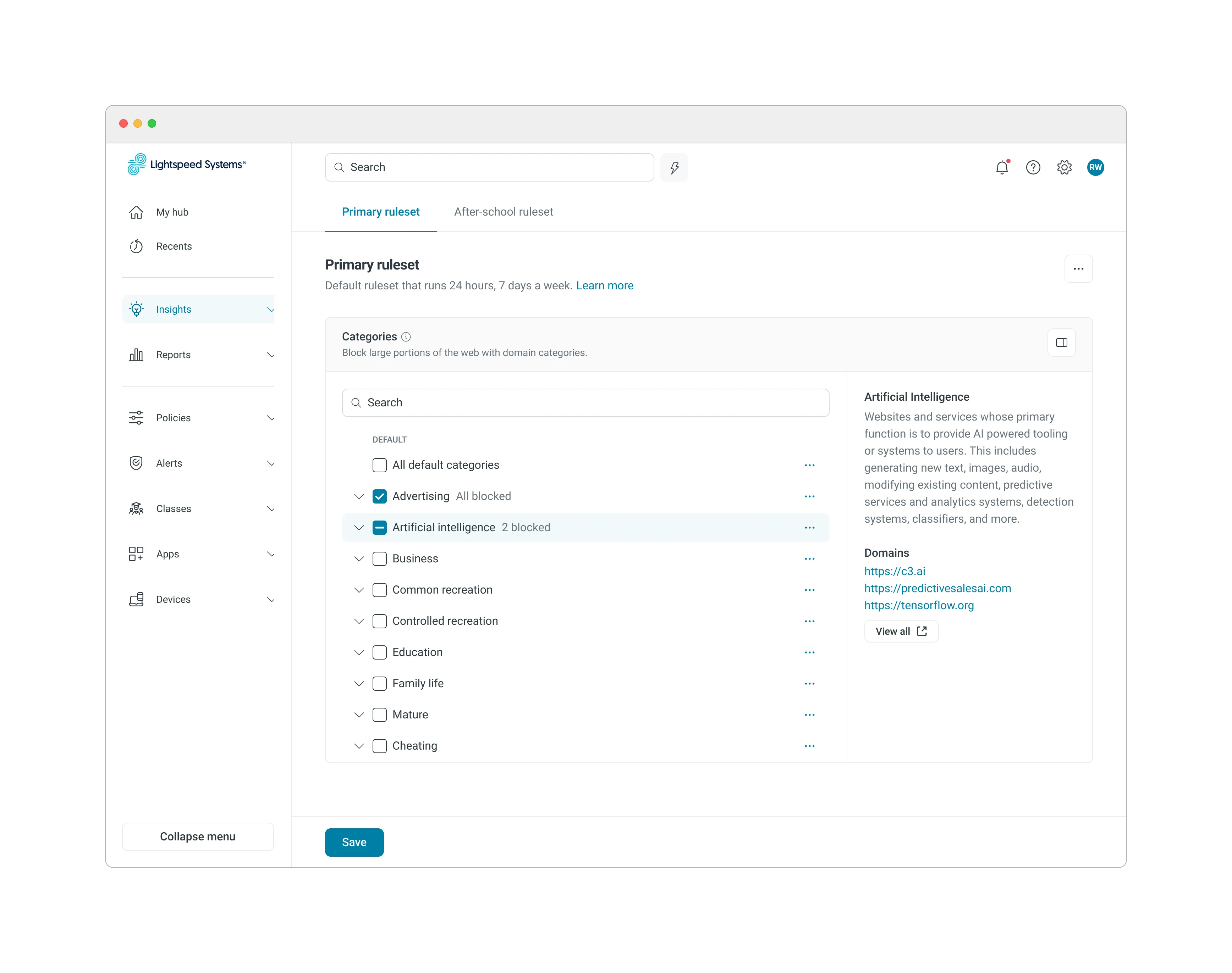
Turned a long list into a compact blocking experience
I developed a new method for managing categories, inspired by Apple’s Screen Time tool, that lets users easily block and unblock categories while quickly understanding each category’s context.
Convinced engineering team to kill policy inheritance for good
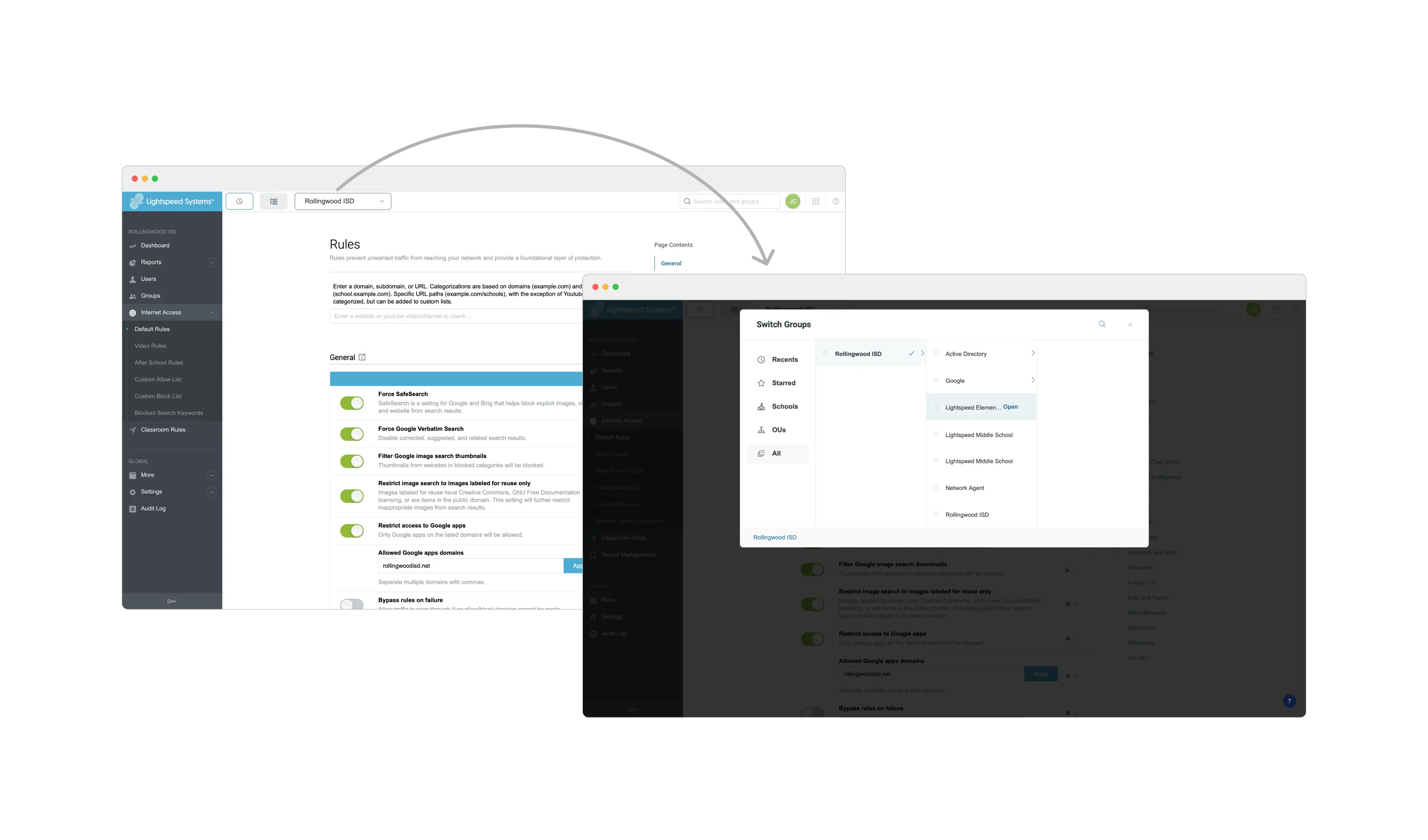
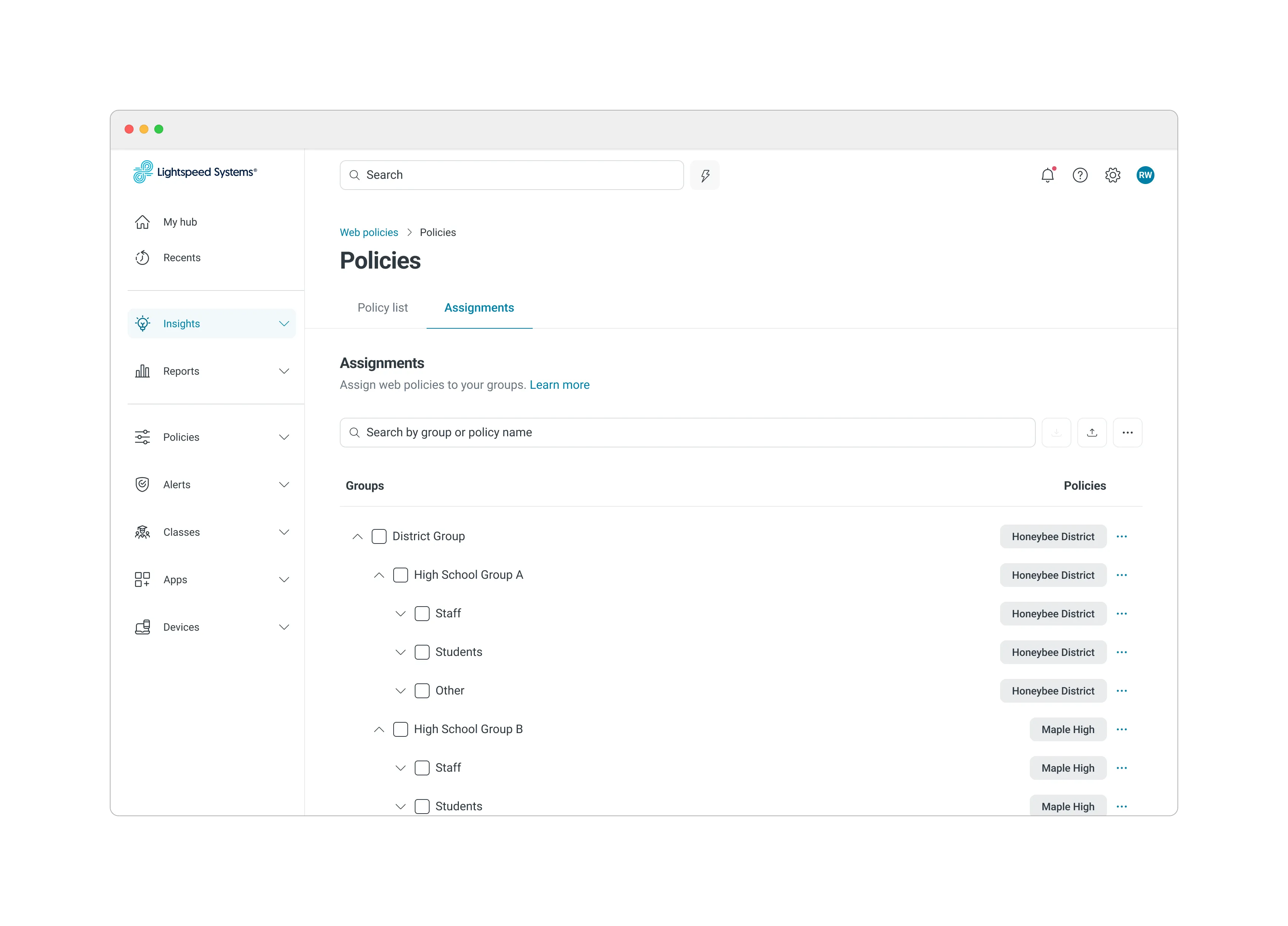
In the legacy experience, IT admins had to switch to a different interface to view policy rules assigned to a school or district, with rules potentially inherited between groups. I proposed a 1:1 relationship between policies and groups instead, so they could be viewed and managed in one place. Then I made the case to engineering: abandon the inheritance structure entirely for a simpler nested-list layout that kept the core benefits without the complexity.
Old way: Switch views to troubleshoot inherited rules.
New way: 1:1 policy-group relationship, one place.
Turned a multi-step hunt into one click
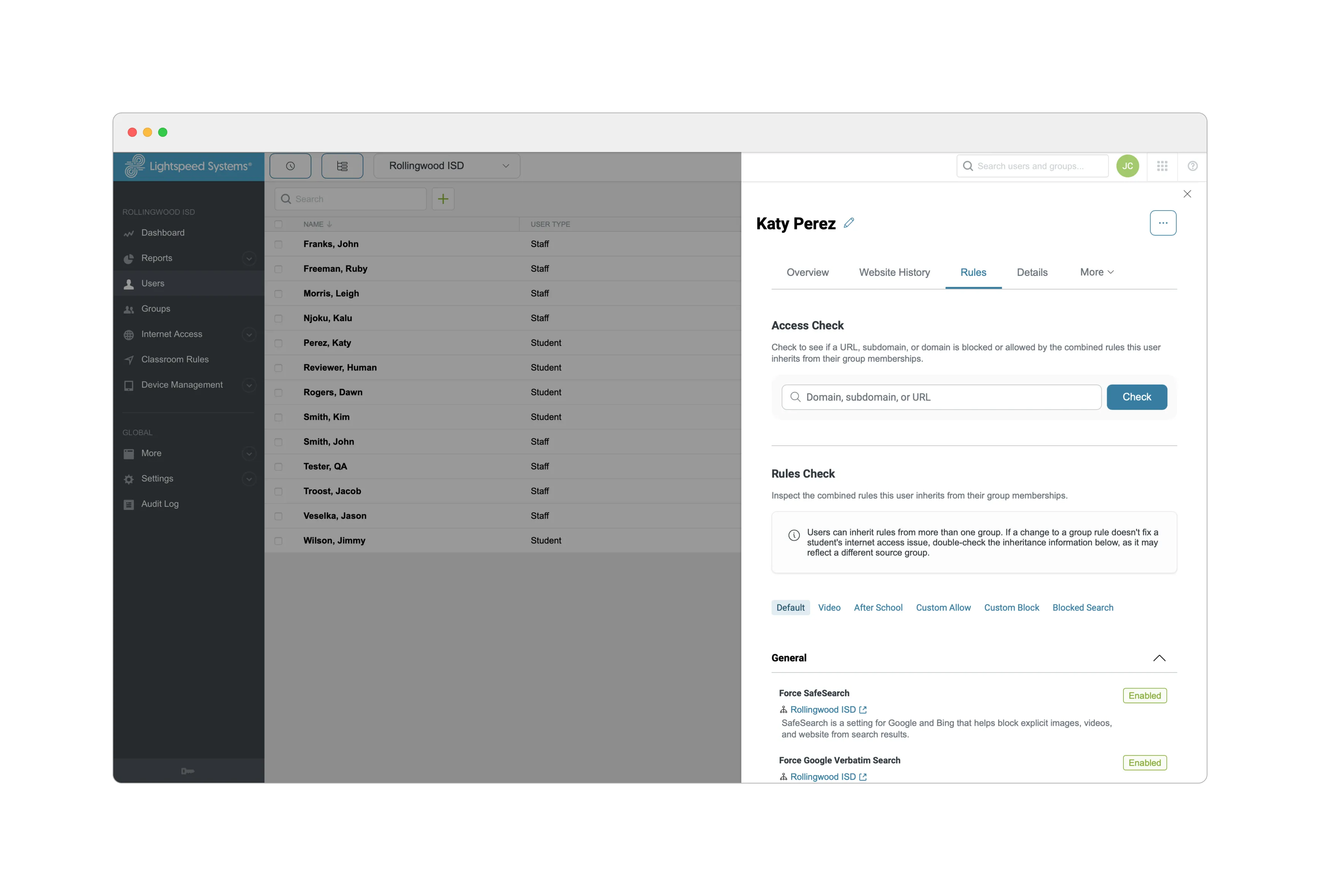
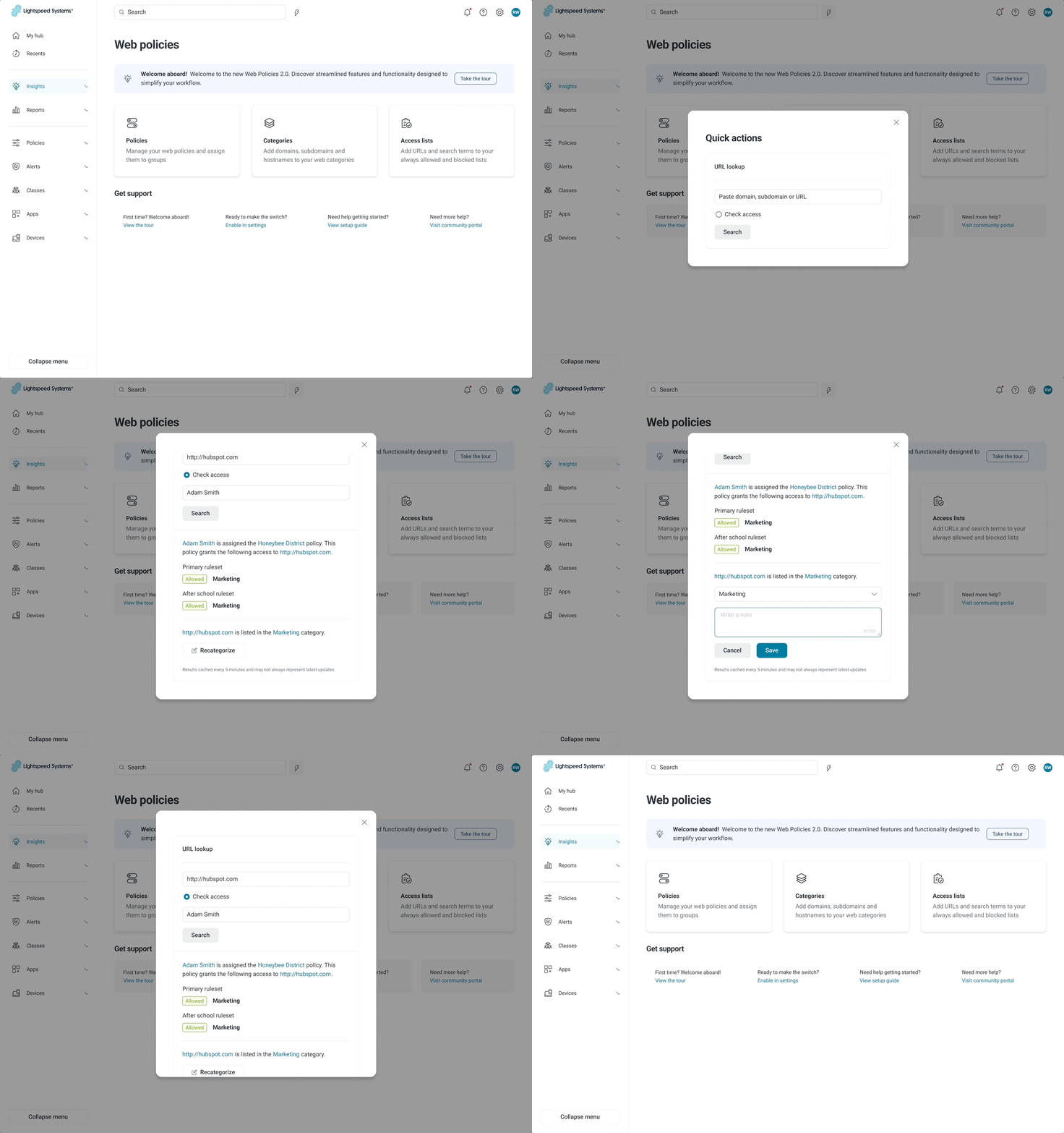
Previously, if a student needed access to a site, an IT admin had to navigate to their profile, review all applied policy rules, and modify the relevant policies, a process that could take hours. With the new policy-group relationship, I designed a global troubleshooting tool accessible from anywhere in the product, letting IT admins quickly link web policies to their impact on users and groups.
Old way: Hunt across profiles and policies.
New way: Diagnose from anywhere, one click.
Grounded every decision in research, not assumptions
Close collaboration with Product and Engineering was essential to address every technical implication of the design, across stakeholders with widely different needs.
My Product partner and I used Miro to compile all design and technical requirements, improving communication with the larger Engineering and Product teams.
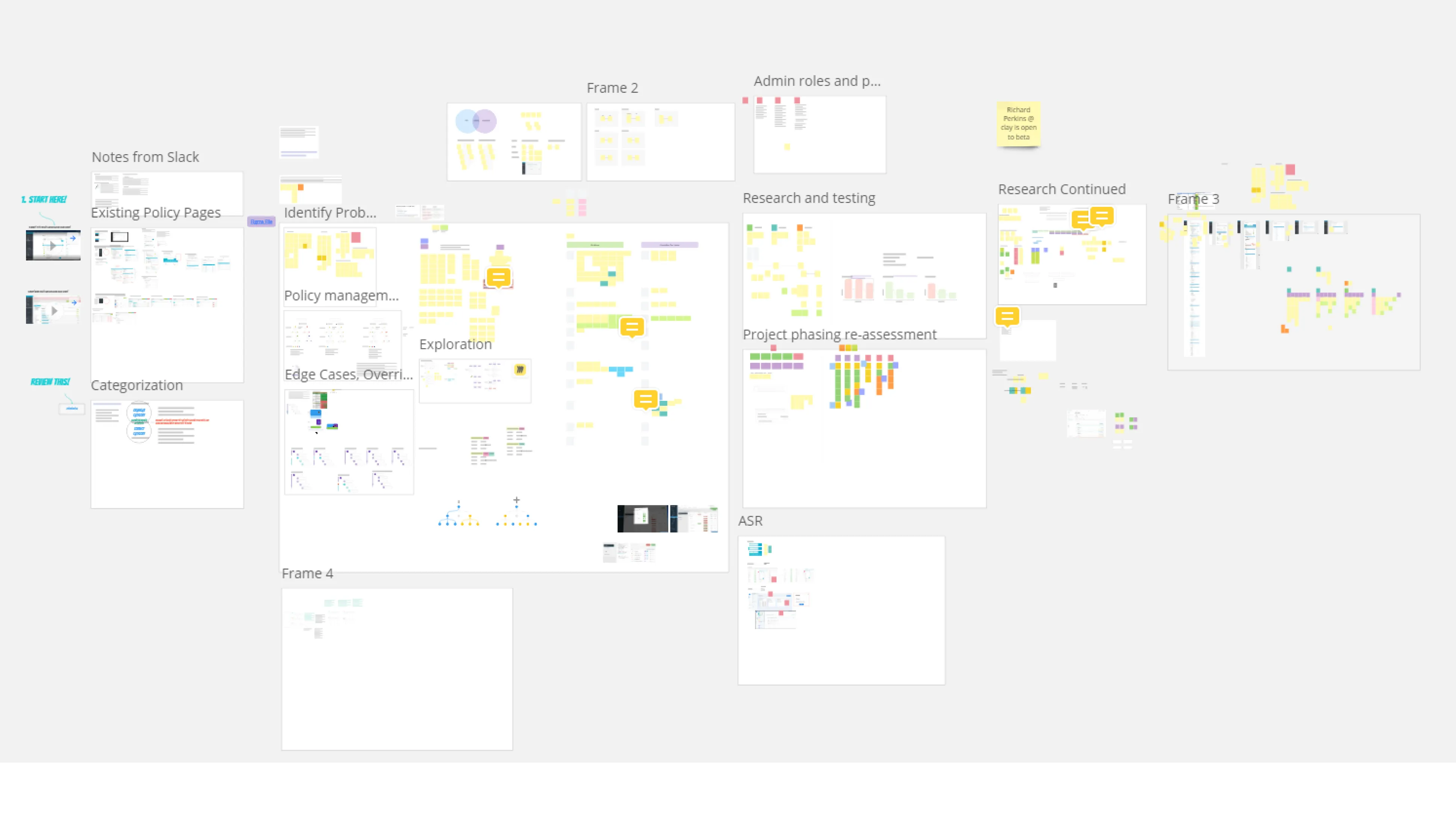
Working session with Design, Product, and Engineering to pressure-test the new policy-group model against real technical constraints.

I used Maze to conduct extensive usability testing.
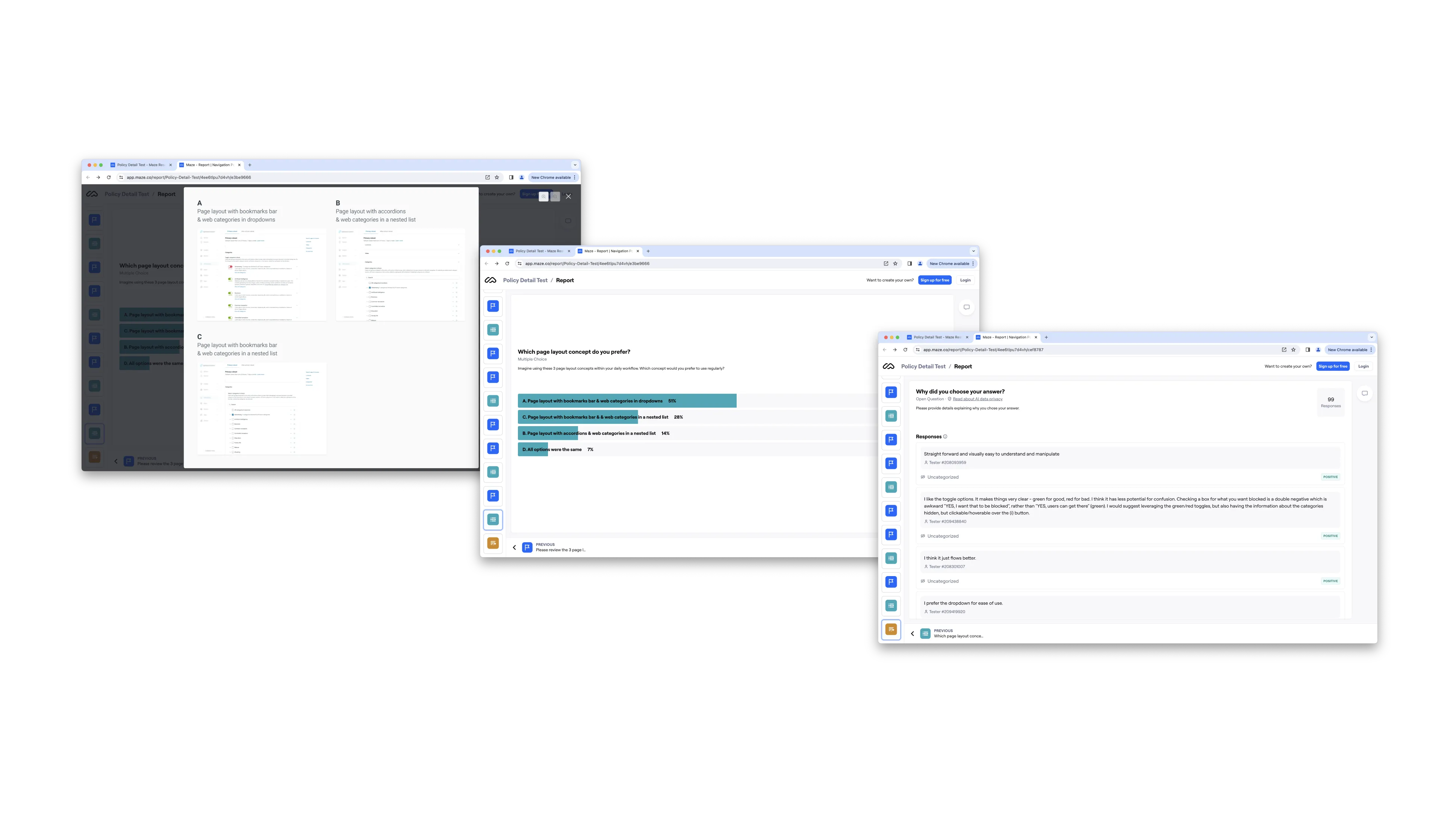
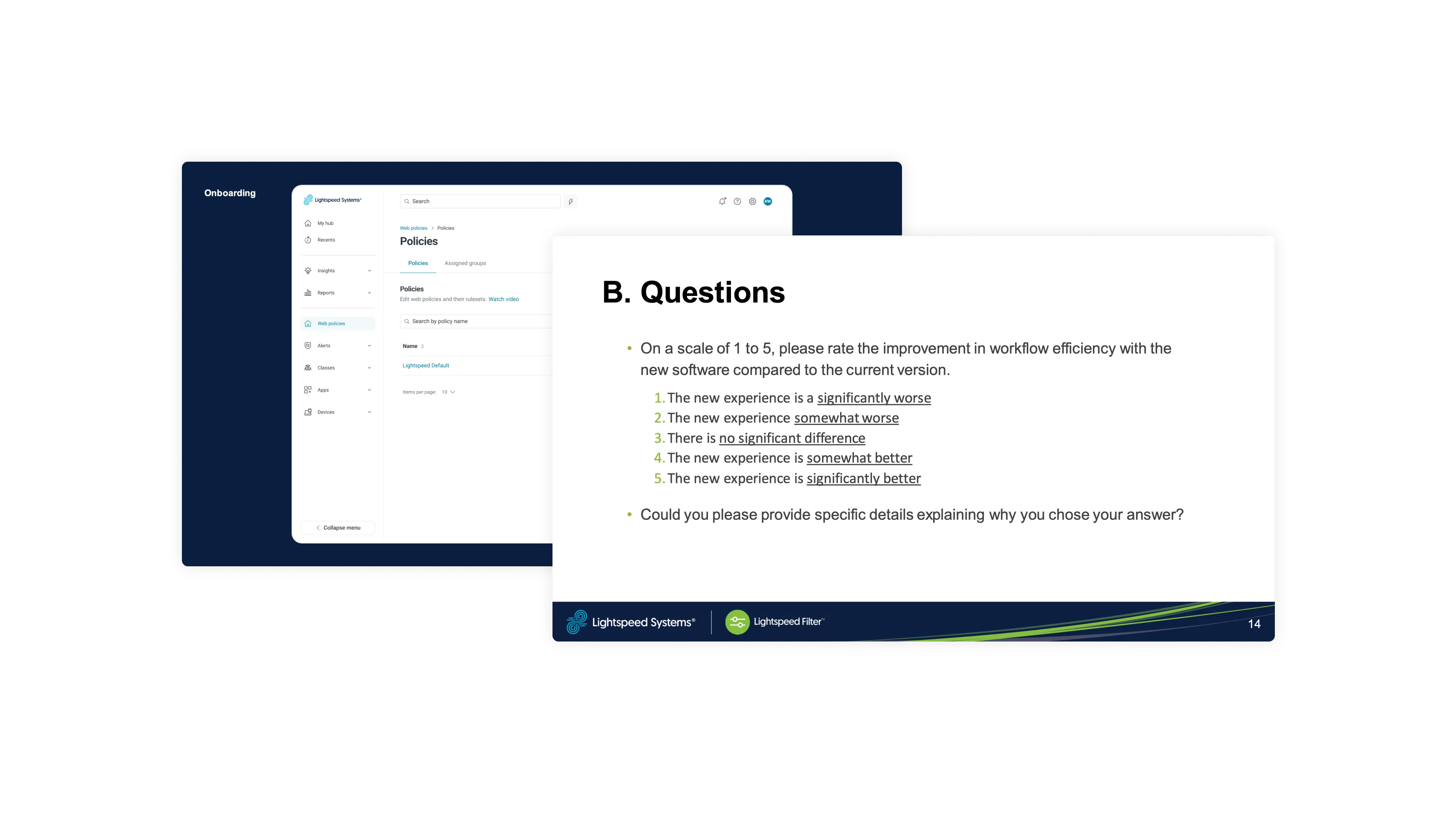
I conducted a user study with several high-value clients to collect feedback on the new information architecture and core feature set.
Would build in more deliberate checkpoints for higher-stakes changes
Looking back, I’m more conscious of a tension in projects like this: simplify too aggressively and you risk making it easier for an admin to change a setting that affects student safety without fully registering it. I’d want to build in a few deliberate checkpoints for the higher-stakes changes next time, not just streamline everything by default.